[ImageGenerator]
This section describes the various options available to the image generator.
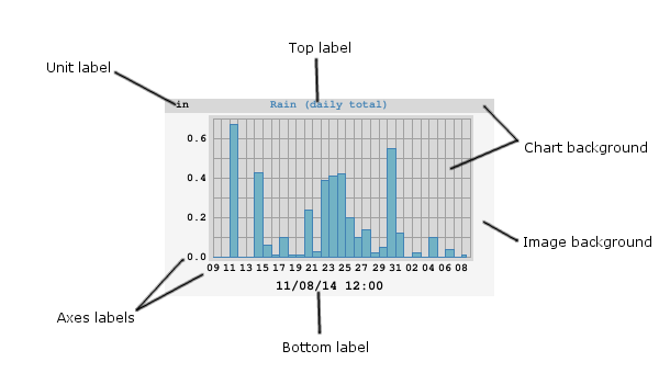
General options
These are options that affect the overall image.
anti_alias
Setting to 2 or more might give a sharper image, with fewer jagged
edges. Experimentation is in order. Default is 1.
with `anti_alias=1`, `2`, and `4`.
chart_background_color
The background color of the chart itself. Optional. Default is
#d8d8d8.
chart_gridline_color
The color of the chart grid lines. Optional. Default is #a0a0a0
daynight_day_color
The color to be used for the daylight band. Optional. Default is
#ffffff.
daynight_edge_color
The color to be used in the transition zone between night and day.
Optional. Default is #efefef, a mid-gray.
daynight_night_color
The color to be used for the nighttime band. Optional. Default is
#f0f0f0, a dark gray.
image_background_color
The background color of the whole image. Optional. Default is
#f5f5f5 ("SmokeGray")
image_width
image_height
The width and height of the image in pixels. Optional. Default is 300 x 180 pixels.
show_daynight
Set to true to show day/night bands in an image. Otherwise, set
to false. This only looks good with day or week plots. Optional. Default
is false.
skip_if_empty
If set to true, then skip the generation of the image if all
data in it are null. If set to a time period, such as month or
year, then skip the generation of the image if all data in that
period are null. Default is false.
stale_age
Image file staleness age, in seconds. If the image file is older than
this age it will be generated. If no stale_age is specified,
then the image file will be generated every time the generator runs.
unit
Normally, the unit used in a plot is set by whatever unit group the types are in. However, this option allows overriding the unit used in a specific plot.
Label options
These are options for the various labels used in the image.
axis_label_font_color
The color of the x- and y-axis label font. Optional. Default is
black.
axis_label_font_path
The path to the font to be used for the x- and y-axis labels. Optional. If not given, or if WeeWX cannot find the font, then the default PIL font will be used.
axis_label_font_size
The size of the x- and y-axis labels in pixels. Optional. The default is
10.
bottom_label_font_color
The color of the bottom label font. Optional. Default is black.
bottom_label_font_path
The path to the font to be used for the bottom label. Optional. If not given, or if WeeWX cannot find the font, then the default PIL font will be used.
bottom_label_font_size
The size of the bottom label in pixels. Optional. The default is
10.
bottom_label_format
The format to be used for the bottom label. It should be a strftime
format.
Optional. Default is '%m/%d/%y %H:%M'.
bottom_label_offset
The margin of the bottom label from the bottom of the plot. Default is 3.
top_label_font_path
The path to the font to be used for the top label. Optional. If not given, or if WeeWX cannot find the font, then the default PIL font will be used.
top_label_font_size
The size of the top label in pixels. Optional. The default is
10.
unit_label_font_color
The color of the unit label font. Optional. Default is black.
unit_label_font_path
The path to the font to be used for the unit label. Optional. If not given, or if WeeWX cannot find the font, then the default PIL font will be used.
unit_label_font_size
The size of the unit label in pixels. Optional. The default is
10.
x_interval
The time interval in seconds between x-axis tick marks. Optional. If not given, a suitable default will be chosen.
x_label_format
The format to be used for the time labels on the x-axis. It should be a strftime format. Optional. If not given, a sensible format will be chosen automatically.
x_label_spacing
Specifies the ordinal increment between labels on the x-axis: For
example, 3 means a label every 3rd tick mark. Optional. The default is
2.
y_label_side
Specifies if the y-axis labels should be on the left, right, or both
sides of the graph. Valid values are left, right or both. Optional.
Default is left.
y_label_spacing
Specifies the ordinal increment between labels on the y-axis: For
example, 3 means a label every 3rd tick mark. Optional. The default is
2.
y_nticks
The nominal number of ticks along the y-axis. The default is
10.
Plot scaling options
time_length
The nominal length of the time period to be covered in seconds. Alternatively,
a duration notation can be used. The exact length of the
x-axis is chosen by the plotting engine to cover this period. Optional.
Default is 86400 (one day).
yscale
A 3-way tuple (ylow, yhigh, min_interval), where ylow and yhigh are
the minimum and maximum y-axis values, respectively, and min_interval is the
minimum tick interval. If set to None, the corresponding value will be
automatically chosen. Optional. Default is None, None, None. (Choose the
y-axis minimum, maximum, and minimum increment automatically.)
Compass rose options
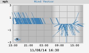
in the lower-left
rose_label
The label to be used in the compass rose to indicate due North.
Optional. Default is N.
rose_label_font_path
The path to the font to be used for the rose label (the letter "N," indicating North). Optional. If not given, or if WeeWX cannot find the font, then the default PIL font will be used.
rose_label_font_size
The size of the compass rose label in pixels. Optional. The default is
10.
rose_label_font_color
The color of the compass rose label. Optional. Default is the same color as the rose itself.
vector_rotate
Causes the vectors to be rotated by this many degrees. Positive is
clockwise. If westerly winds dominate at your location (as they do at
mine), then you may want to specify +90 for this option. This
will cause the average vector to point straight up, rather than lie flat
against the x-axis. Optional. The default is 0.
Plot line options
These are options shared by all the plot lines.
chart_line_colors
Each chart line is drawn in a different color. This option is a list of
those colors. If the number of lines exceeds the length of the list,
then the colors wrap around to the beginning of the list. Optional. In
the case of bar charts, this is the color of the outline of the bar.
Default is #0000ff, #00ff00, #ff0000.
Individual line color can be overridden by using option color.
chart_fill_colors
A list of the color to be used as the fill of the bar charts. Optional.
The default is to use the same color as the outline color (option
chart_line_colors).
chart_line_width
Each chart line can be drawn using a different line width. This option
is a list of these widths. If the number of lines exceeds the length of
the list, then the widths wrap around to the beginning of the list.
Optional. Default is 1, 1, 1.
Individual line widths can be overridden by using option width.
Individual line options
These are options that are set for individual lines.
aggregate_interval
The time period over which the data should be aggregated, in seconds.
Alternatively, a duration notation can be used.
Required if aggregate_type has been set.
aggregate_type
The default is to plot every data point, but this is probably not a good
idea for any plot longer than a day. By setting this option, you can
aggregate data by a set time interval. Available aggregation types
include avg, count, cumulative, diff, last, max, min, sum,
and tderiv.
color
This option is to override the color for an individual line. Optional.
Default is to use the color in chart_line_colors.
data_type
The SQL data type to be used for this plot line. For more information, see the section Including a type more than once in a plot. Optional. The default is to use the section name.
fill_color
This option is to override the fill color for a bar chart. Optional.
Default is to use the color in chart_fill_colors.
label
The label to be used for this plot line in the top label. Optional. The default is to use the SQL variable name.
line_gap_fraction
If there is a gap between data points bigger than this fractional amount of the x-axis, then a gap will be drawn, rather than a connecting line. See Section Line gaps. Optional. The default is to always draw the line.
line_type
The type of line to be used. Choices are solid or
none. Optional. Default is solid.
marker_size
The size of the marker. Optional. Default is 8.
marker_type
The type of marker to be used to mark each data point. Choices are
cross, x, circle, box, or none. Optional. Default is none.
plot_type
The type of plot for this line. Choices are line, bar,
or vector. Optional. Default is line.
width
This option is to override the line width for an individual line.
Optional. Default is to use the width in chart_line_width.